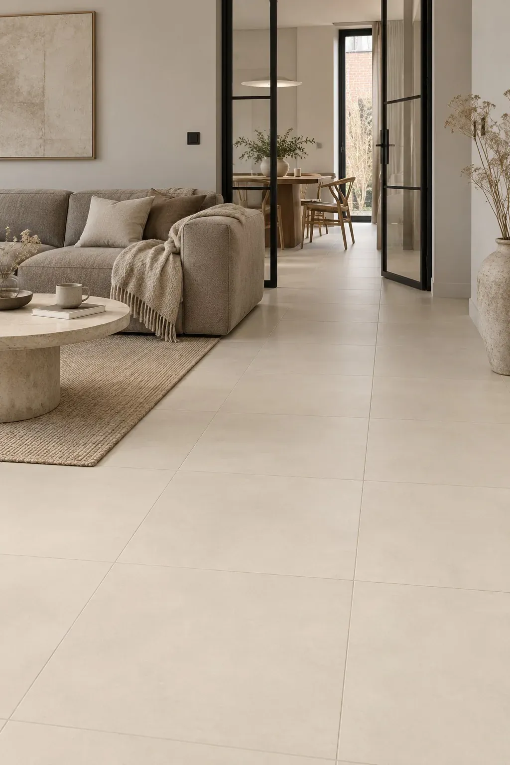
Concrete-look tiles give a calm, architectural base and combine with almost anything. They only go wrong when the shade is too cold, the format too large for the room or the grout too contrasting. This article covers the choices that make the difference, from colour temperature to the transition to the terrace.
Colour temperature: grey is rarely just grey
With concrete-look, many people think of cool grey, and that is often where it goes wrong. In a north-facing room or one with little daylight, cool grey quickly becomes hard and bluish. Greige, sand, taupe and warm grey give the same clean appearance but feel more liveable. In a south-facing room with plenty of light, a cooler shade can work.
So look at the tile in the showroom in daylight, and take into account the orientation of your room, your kitchen fronts and your wall colour. The colour temperature of your lighting counts too: warm white light (2700 to 3000 K) makes grey warmer than neutral white does.
The palette is broad: Siena has seven shades from Ivory to Dark Grey, Cortona six, Lusano four warm and neutral shades and Montara the dark Black and Dark Grey.
Glazed ceramic or through-body porcelain
Concrete-look comes in two constructions, and you only see the difference when damage occurs:
- Glazed ceramic or porcelain: the concrete pattern is a print on a glaze layer. The body underneath has a different colour, so a chip on an edge shows. Economical and perfectly fine for most homes. For a floor, choose a glaze with wear class PEI 4.
- Through-body porcelain: the body of the tile has the same colour as the surface. A chip or scratch remains virtually invisible. Higher density, suitable for intensive and commercial use. Siena is an example of through-body porcelain.
Does the tile continue outdoors? Then water absorption counts as well: below 0.5% is frost-resistant.
Format and joint: 60x60, 90x90 or 60x120
- 60x60 cm: compact rooms, hall, bathroom, budget projects. The most requested concrete-look format.
- 90x90 cm: square large format for an open-plan living space. Siena comes in both formats, so hall and living space can be matched.
- 60x120 cm: rectangular, also for walls. See Concrete.
Lay concrete-look in a straight bond; that suits the even pattern. With 60x120 a one-third offset is possible, never a 50% offset (brick bond). Joint of 2 to 3 mm with rectified tiles, in the tile shade or one shade darker. A white grout with grey concrete creates a chessboard and discolours.
Matt, R10 and maintenance
Matt is the standard for concrete-look. Series such as Siena and Montara achieve slip resistance class R10: enough grip for a living space and kitchen, even with wet feet coming in from the garden. R9 is acceptable indoors but becomes slippery when wet.
Maintenance: clean with a pH-neutral product and avoid soap-based cleaners. They leave a film that dirt sticks to, and on even concrete-look that is exactly where it shows. A matt tile with some texture hides dirt better than a flat one, but occasionally needs a microfibre mop instead of a cloth mop. Dark concrete-look shows dust and limescale, light shows stains; a mid-tone is the easiest in practice.
Add warmth: wood, textiles, light
A clean base only works with a counterweight. Oak or walnut wood, textiles, warm wall colours (off-white, sand, clay) and warm white lighting reinforce concrete-look. Black steel works as an accent, not as a second main material.
In the bathroom, the same concrete-look can go on floor and wall: one colour, one format, a monolithic volume. In a living space, you would rather combine concrete-look on the floor with a light, painted wall.
Concrete-look from indoors to outdoors
Concrete-look is the look that carries most easily from living space to terrace. Indoors you lay 9 to 10 mm, outdoors 20 mm in a related shade. For example Siena or Cortona indoors and Sora Greige or Light Grey (20 mm, R11) outdoors. Choose the same format (for example 60x60) if you want the grout lines to run through.
Do not expect an identical tile: an outdoor tile has a textured surface for grip and is laid to a fall. What you do get is one colour family from indoors to outdoors. Read Choosing terrace tiles for outdoor installation.
Conclusion
Concrete-look succeeds when the shade is not too cold, the format not too large for the room and the grout not too contrasting. Choose the material by use (glazed for residential, through-body for intensive use), matt with R10 for the floor, and add warmth with wood, textiles and light. Compare the shades in the showroom in Merelbeke with your plan and colour samples to hand.
Continue your research
FAQ
Frequently asked questions
Does concrete-look quickly become too cold?
Only with cool grey in a room with little or north-facing light. Choose greige, sand or taupe, combine with wood and textiles and use warm white lighting.
Which grout colour suits concrete-look best?
The tile shade or one shade darker, with a 2 to 3 mm joint for rectified tiles. Avoid white or strongly contrasting grout.
Can concrete-look go on both floor and wall?
Yes. On the wall the tile does not need a slip resistance class, so a smoother finish is also possible. The same series on floor and wall gives a monolithic look.
What is the difference between ceramic and through-body porcelain?
With glazed ceramic the concrete pattern is a print on a glaze layer; a chip shows the different colour of the body. With through-body porcelain the whole tile is coloured and damage remains almost invisible.
Are concrete-look tiles easy to maintain?
Yes. Clean with a pH-neutral product without soap. Matt tiles with texture hide dirt but need a microfibre mop. A mid-tone shows the least.
Il Mondo Tiles
Compare tiles in the showroom
Bring measurements or photos. We help you compare sizes, finishes and pricing for your project.